
Behind the Boom of Creamy Style: Do You Know These Design Details?
Introduction: Why Creamy Style Is Everywhere in 2025
Step into any trendy home or boutique hotel in 2025, and you’ll likely be greeted by creamy interiors—soft, warm, and irresistibly inviting. But why has this style exploded in popularity? It’s not just about color; it’s a full-sensory experience that blends comfort, elegance, and a touch of nostalgia. If you’ve ever wondered how to nail this look (or why it’s so hypnotizing), let’s dive into the details.
1. What Exactly Is Creamy Style?
The Definition of Creamy Aesthetics
Creamy style isn’t just “beige.” It’s a rich, layered approach that uses warm off-whites, soft ivories, and muted taupes to create a cocoon-like atmosphere. Think of it as a latte—smooth, balanced, and deeply comforting.
How It Differs from Other Neutral Styles
- Minimalism: Too stark; lacks warmth.
- Scandinavian: Cooler tones; prioritizes functionality.
- Farmhouse: More rustic; leans on distressed woods.
Creamy style, meanwhile, is luxuriously soft without feeling sterile.
2. The Psychology Behind Creamy Interiors
Why Cream Feels So Comforting
Color psychology shows that creamy hues evoke safety, warmth, and nostalgia—like a hug from your favorite sweater. In a fast-paced digital world, these spaces act as sanctuaries.
The Role of Softness in Modern Design
With remote work and mental well-being in focus, people crave gentle, soothing environments. Creamy interiors reduce visual noise, making them perfect for relaxation.
3. Key Elements of Creamy Style
The Perfect Creamy Color Palette
- Warm Whites (e.g., Swiss Coffee by Benjamin Moore)
- Muted Taupes (e.g., Accessible Beige by Sherwin-Williams)
- Hints of Caramel or Blush for depth
Textures That Make Creamy Design Pop
- Bouclé upholstery (the “teddy bear” of fabrics)
- Wool throws and linen curtains for organic contrast
- Matte ceramics and ribbed glass for tactile interest
Furniture Shapes That Enhance the Look
Rounded edges, cloud-like sofas, and curved arches amplify the cozy vibe. Sharp angles? Not here.
4. How Lighting Transforms Creamy Spaces
Natural vs. Artificial Light in Creamy Rooms
North-facing light can make creams look chilly—warm LED bulbs (2700K–3000K) fix this. South-facing rooms? Embrace the golden glow!
Best Light Fixtures for a Warm Glow
- Paper lanterns (diffused light)
- Brass or bronze sconces (adds warmth)
- Candle-style bulbs (flicker-free coziness)
5. Creamy Style in Different Rooms
Bedrooms: A Sanctuary of Softness
Layer cream-on-cream bedding with varying textures (quilted, knitted, silky). Add a dark wood nightstand to ground the space.
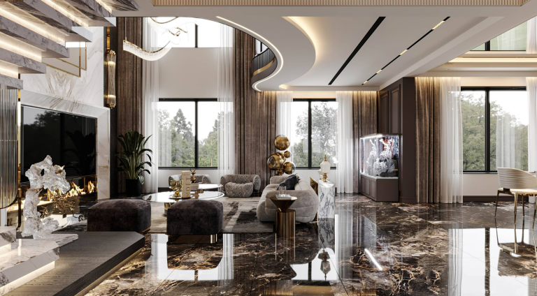
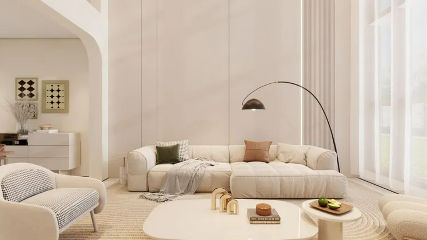
Living Rooms: Cozy Yet Sophisticated
A Bouclé sectional + a caramel leather chair creates contrast. Use a stone coffee table to prevent monotony.
Kitchens: Warmth Meets Functionality
Creamy cabinets + honed marble countertops = timeless. Open shelving with muted pottery keeps it airy.
6. Combining Creamy Style with Other Trends
Creamy Meets Japandi: Minimalist Harmony
Add light oak accents and black metal frames for structure. Keep clutter hidden.
Creamy and Art Deco: Luxe Contrasts
Pair creamy walls with gold mirrors and geometric rugs. Glam, but not overwhelming.
7. Common Mistakes to Avoid with Creamy Design
Going Too Monochromatic
Without contrast (e.g., dark wood, black fixtures), the room can feel flat.
Ignoring Texture Variety
A cream room with only smooth surfaces? Yawn. Mix matte, nubby, and glossy finishes.
Conclusion: Is Creamy Style Here to Stay?
Given its versatility, warmth, and timelessness, creamy style isn’t just a trend—it’s a design philosophy for those seeking comfort without sacrificing sophistication. Will you embrace it?
FAQs About Creamy Interior Design
1. Does creamy style work in small spaces?
Yes! It makes rooms feel larger and airier—just add mirrors and avoid heavy drapes.
2. How do I keep a creamy room from looking dirty?
Choose stain-resistant fabrics (e.g., performance linen) and warm undertones (yellow-based creams hide wear better).
3. Can I use creamy style in a modern apartment?
Absolutely. Pair it with sleek metals and concrete for a contemporary twist.
4. What’s the best wall color for creamy interiors?
Try Alabaster (SW 7008) or White Dove (OC-17)—they’re warm but not yellow.
5. How do I add color without ruining the creamy vibe?
Dusty blues, sage greens, or terracotta accents complement without overpowering.
This authoritative yet engaging guide breaks down the creamy trend with actionable tips and psychological insights, ensuring your space is both stylish and soul-soothing. Ready to dive into the cream? 🍦